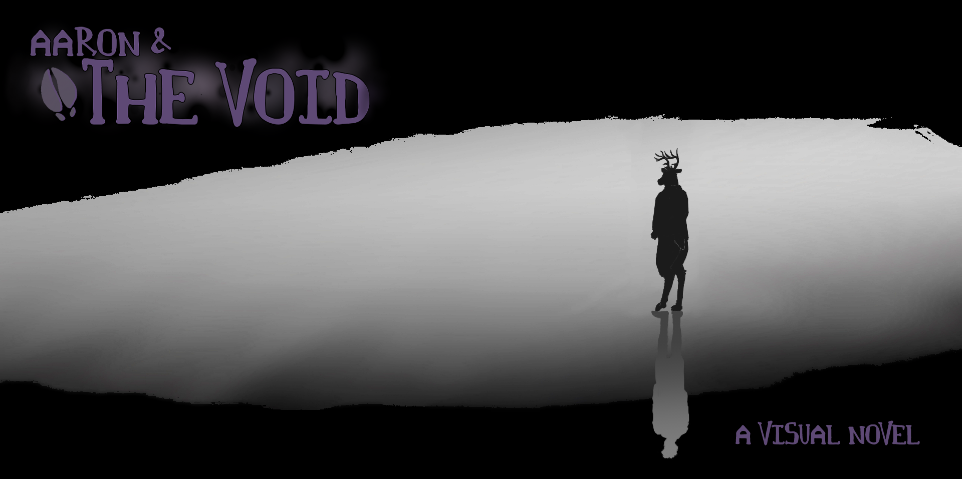
Aaron and The Void
Devlog - My Sprite Creation Process
Hello! It’s been a while... I'm desperately trying to finish the final touches on the script, as I'm fairly certain we've got initial sprites for all characters in Build 0.6. More to come on that.
But today’s an exciting development blog, because we’re taking a deep dive into how I create (and re-create) character sprites! Every artist’s process is vastly different, whether it be their tools, technique, and style. We’ll talk about mine, so if you are only interested in certain aspects of the process, I made an outline (and tried to make Itchio let me do links to each section).
- 1. Gather tools: Clip Studio Paint, Wacom tablet
- 2. Find (good) references, clothes, and models for poses
- Camera tools with models
- Set height on model
- Angled vs Straight-on perspective
- Sculpt a (realistic) head!
- Not necessary, but nothing confuses me more than an animal’s head at an angle in 3D
- 3. Sketch layers
- 4. Draw body vector layers
- 5. Cover with clothes vector layers
- 6. Colorize layers
- 7. Shading and masking
- 8. Separate the head for facial expressions
- 9. Set up for layered imagery in Renpy
- 10. Additional cleanup & posing
My expectation is that some things will be interesting, new, or useful knowledge to you, or raise some questions or conversations. I welcome those conversations, as long as they’re respectful.
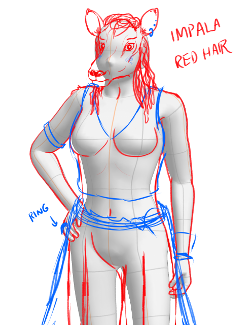
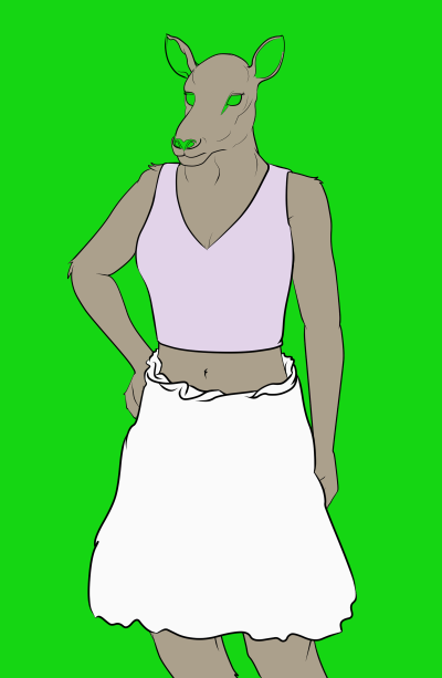
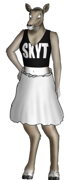
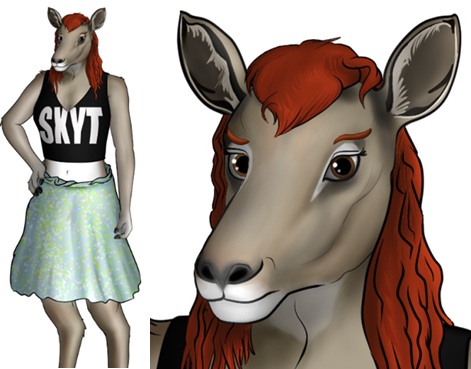
And this outline’s a lot. But designing awesome sprites takes a lot! To honor today’s journey into sprite creation, we’ll be looking at the upcoming character, Lesley – she’s a female impala, and Aaron’s highschool fling - in detail. Let’s get into it.
1. Obtain tools
My laptop computer and its software do the heavy lifting. Before I committed to creating a visual novel, I had to make a financial commitment: buying a digital tablet. I owned a small Wacom tablet, but it didn’t have a screen, and its surface was deteriorating. I put down about $300 for a Wacom One, and it’s been holding up great for 3 years now. Its pen and glass screen has the expected wear and tear, but is showing no other signs of misbehaving. So if you can save up and buy a tablet with a screen, you’ll be in a great spot to draw. I bought Clip Studio Paint when it was on sale, which is where every sprite is sketched and finalized. There are a couple other programs I use which we’ll get into further down.
2. Find (good) references, clothes, and models for poses
The greatest freedom you have with creating sprites is using anything you find as reference material. In this case, reference material means you refer to it – you don’t copy it directly (i.e., stealing!) or generate it (NO). You can borrow inspiration from images you like, and that means looking for ideal material.
Be picky about the images. Are they giving you the right colors and angles for the vision of this character in your head? If the character has fur, what is the combination of fur colors at their base? Do you have the right paintbrushes to accentuate fur or scales?
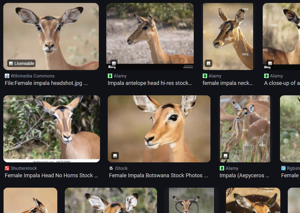
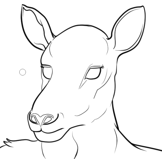
My visual novel is fairly realistic when it comes to this, so I can use the colors directly from pictures of feral impala antelope in the wild. Noting here that female impalas don’t have horns, so specifying female in my reference searches was important.
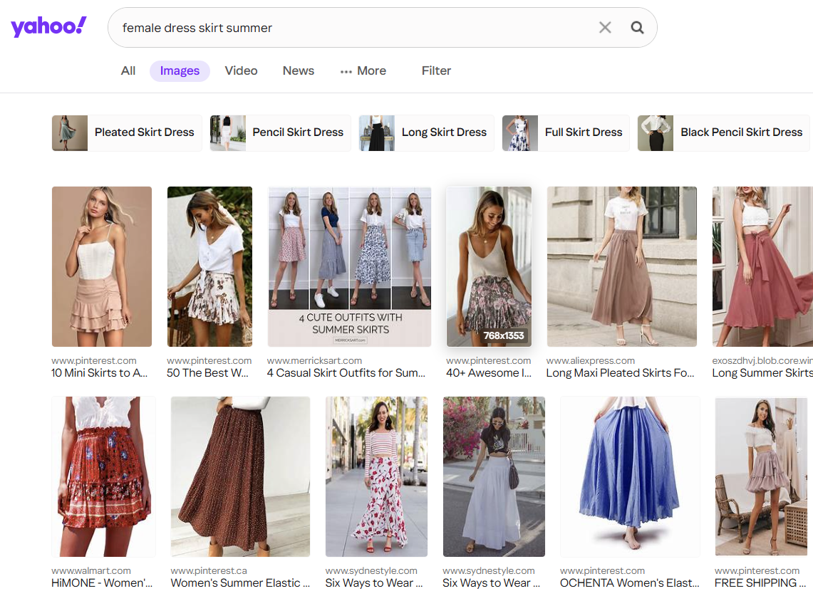
Next: what kinds of clothes do you want, and have you thought about accessories like jewelry or tattoos? A search for “skirt” versus “female dress skirt summer” will divert your results.
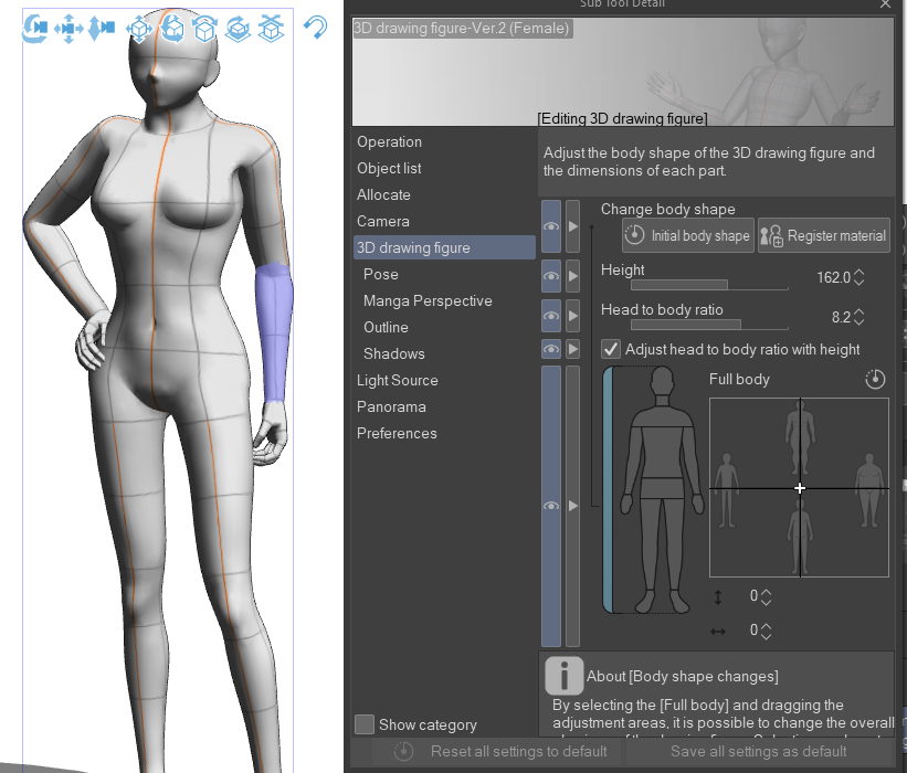
As for posing, Clip Studio Paint offers a variety of default poses with their human models. I’ve used these in almost every character pose I design – you can even create multiple cameras (points of view) to ensure your model’s pose makes sense. Sometimes the hands clip into the body, which – last time I checked – isn’t possible in reality.
Clip Studio lets you set the 3D drawing figure’s height, head-to-body ratio, and body shape sizes individually. If you care about your characters having different heights, Clip Studio has a way to do that with their models. For example, if the Height is set to 183.0 (centimeters), that’s roughly 6-foot tall.
One challenge has been repurposing human models for anthropomorphic characters. The general rule is that human legs make up 3/5 of our overall height, but animals don’t follow that rule. So I often end up searching for tutorials on ways to draw anthropomorphic legs, tails, and hands, and then they get adjusted for the human model. I recently bought a furry manga book for additional help, as well – it’s not perfect, but it did help me with a few things.
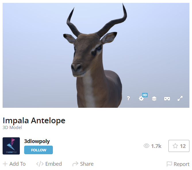
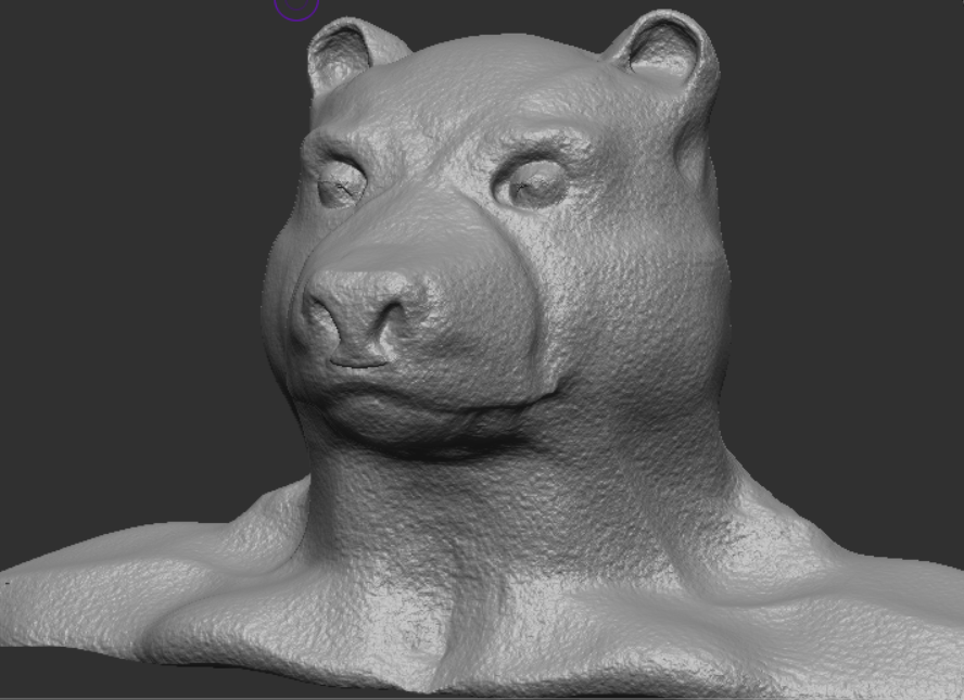
Despite all the reference material that exists out there, the hardest thing for me to draw are the heads of various animals at different angles. Sometimes it’s just impossible to get that perfect reference image where the animal’s head is at the angle you’re looking for. Luckily there are 3D models of most feral animals via Sketchfab and other sites like this - but those aren’t always 100% accurate in their depiction. For example, the ears on this model are probably too small.
So, in the cases of the main cast, I “sculpt” 3D models of their heads in a software called ZBrushCore Mini. The 2021 version (I believe) was the last freely-available version they produced.
Scultping models of your character’s heads is NOT needed, but it was revolutionary for me as an artist. I couldn’t wrap my head around how a muzzle should look at a 15% degree angle when all Clip Studio Paint offers is a rounded human model head. A lot of visual novel sprites are angled because the character may be talking directly to the reader or to another character on screen. None of my sprites followed this rule in Build 0.1, which is why I’ve spent time redesigning every character sprite.
Anyway, sculpting the rough shapes of what I want for each character and positioning them at the angle I want to draw them has elevated the sprites, and people give me positive feedback for them. I’m happy with this process!
3. Sketch layer
Okay, finally drawing stuff - took long enough! Kidding aside, once the reference materials and (if applicable) head sculpt are ready, I begin to sketch in an off-color like bright red or blue to trace the outlines of the body and head. I want a rough estimation of what the final design will be. I’ll also create a separate sketch layer for clothing items. By sketching first instead of directly drawing the final product, you can make changes if you aren’t satisfied with how the sketch looks. You haven’t committed to the design yet, if that makes sense. And you get extra practice, too! Trust me, it’s worth it.
4. Vectorize layer
Once sketching is done, I create a vector layer using Clip Studio’s default G-Pen, at various point widths and enhanced settings for simplifying/connecting lines. Vector lines are manipulative, meaning you can adjust the sizing and positions of the lines after you draw them. As a self-confessed perfectionist, I want the best-possible product without succumbing to the limitations of what my hand drew.
I draw vectors over the sketch lines, taking my sweet time with this part because these are the borders of my sprite. It’s also the aspect of this process that I still need improvement with - my lines taper off, or Clip Studio creates artifacts or additional vector points… not to mention the line art thickness fluctuates. The style isn’t consistent, but it gets the job done.
Over time I’ve learned that non-black lines are useful, too. Not everything needs to be surrounded by black lines, unless you’re going for a certain style. You can select individual vector lines and change their color from the menus on the side.
5. Cover with clothes layers
Let’s talk about layer management. Just like the sketching layers, any clothes you intend to draw on your character should not share the same vector layer as your character’s body. It’s so much harder to make changes to a character’s body if you put everything on the same layer, as I’ve come to learn. There’s been cases where I drew the character initially with no intention to create other poses for them, but then I had to go back and fix my laziness when the story called for more.
So, don’t be lazy – separate clothes from body! Create as many layers as you want and need; you’re not going to run out of space.
6. Colorize layer
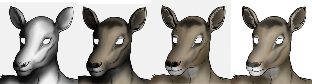
Moving along… once the line art is satisfactory, you can fill the shapes with a rough base color. It doesn’t have to be the final color, either. Impala antelope have a combination of different fur colors, so instead of a paint tool I used an airbrush to get a softer gradation in the different colors. If you’re into detailed shading or blending (like I am), you’ll want to find a good set of colors that interpret the average shade of your character’s fur. Put any shading on its own layer so you can go back and make adjustments later.
In the above image, I used a bright color – green – to ensure everything has a base color. Sure enough, I forgot the ears and nostrils.
In Clip Studio Paint, utilizing reference layers is a must. You can set your vector layer to be a reference layer and check the setting “Do not cross lines of reference layer” for your brush. This lets you airbrush colors without going past the vector lines. Before doing this, make sure your vector lines connect so you don’t spill into other areas, or leave certain parts as blank. If you prefer filling color by hand (with a large pen tool), go for it – you won’t spill over your lines or start blending transparent nothingness with your base color.
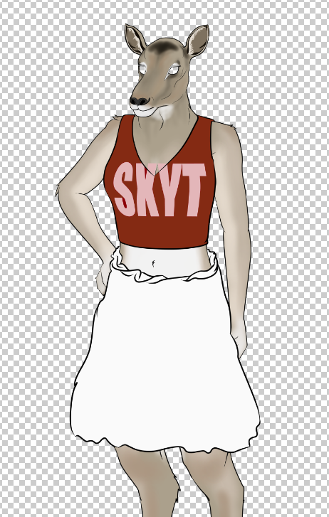
Then create the base color layer for your clothing items. Clothing comes in all shades, so you have to think about what would look good on a creature with, say, grey fur. Also, what parts of their personality are you emphasizing with their clothing choices? And if your novel’s backgrounds use certain colors a lot, avoid using those colors in your character’s clothes. Red pops out (which is why restaurant logos use red a lot), while blue calms you down and fades into the back. You don’t have to know color theory, but there are plenty of resources and reference materials out there to help you imagine.
7. Masking and shading
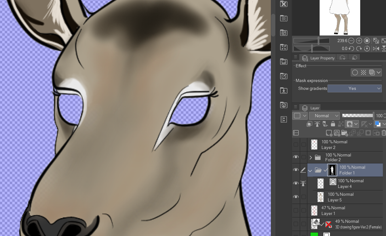
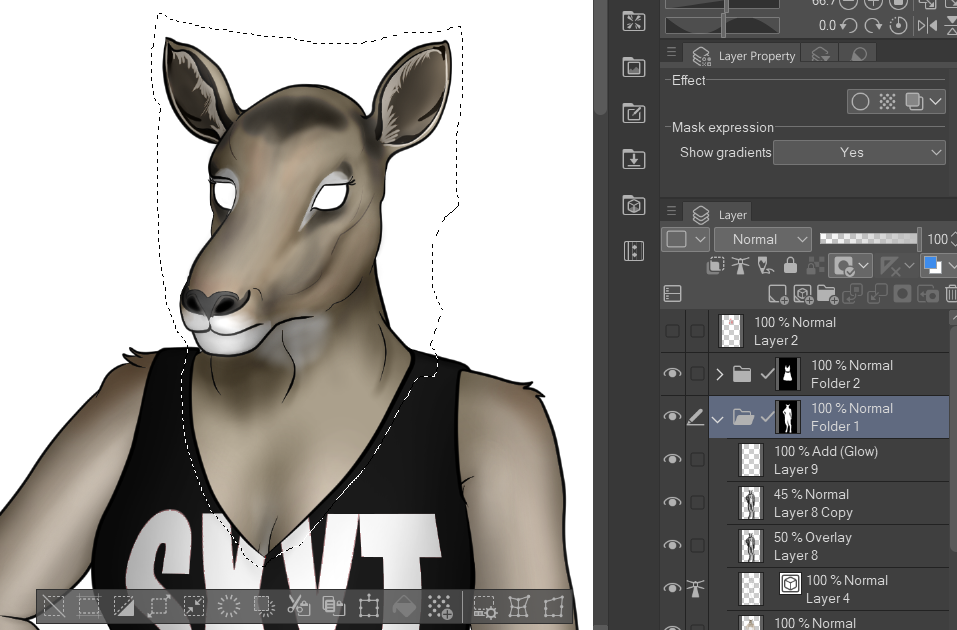
So we have a base color layer and vector line layer for body and clothes. Now we need to make EXTRA certain we don’t color outside the lines. We need to create some masks! Masking is crucial for anyone creating character sprites. If you don’t know what masking is, it will let you – for example – hide the parts of the lettering on Lesley’s shirt that extend past the top without using the Eraser tool. You have no idea how many times I had to go back and fix minor drawing mistakes before I learned how to mask a layer.
What I do is select the vector layer and color layer, put them into a folder together, right-click the folder, and create a mask. If everything went right with coloring, there shouldn’t be any “holes” in the mask. If you find holes, fill them in, or use the selection tools to ‘grab them’ before creating the mask. It’s important to get this done before shading, because if you have holes in your sprite, shading over those holes makes it really hard to fix later.
There’re some tricks we can use while shading that masks help hide. You can right-click the mask in the folder hierarchy and choose ‘Show mask area’ to see a faint visualization of what is getting masked.
After the mask is created, I can begin shading. When I started drawing sprites, I had no concept AT ALL of shading. In fact, I was intimidated by how to ‘shade’ a character without understanding how lighting works.
But guess what? You don’t have to be a lighting expert to be able to draw sprites. Because once you do it a couple times, you can get the hang of what to look for.
The one thing you do need to do is determine the direction light is coming from. Imagine that someone’s pointing a light from off-screen at your character’s body. What parts of their body would be covered in light, and which parts would be hidden in shade?
Use the in-application human models and play around with the lighting tools to gain some understanding of this concept. Clip Studio Paint’s 3D human models have a bit of default light/shade applied to them as well. You can get an idea of where shadows fall from a human-shaped character.
On the face of an anthropomorph, this gets tricky. Muzzles and beaks block out light from the other side and underneath the chin. If their eyes are inset, the light won’t get into there; same goes with large ears. So much to consider!
Create a separate layer for your shading. I use a black spraycan paint tool, first at a really large point size like 150 or 200pt, then I get smaller and smaller until I’m shading the littlest details.
Then I apply a blending mode to the shading layer: “Overlay”. This makes it so even though I used black, the shading mixes with the color layer underneath. If you don’t know what blending modes are, or how they work, do yourself a favor and read about them. They are a game changer.
Other tips:
- If you don’t want to shade with an airbrush, you can draw vector lines for your shading and fill these areas in with black ink too. There’s no right or wrong tools for this.
- If airbrushing or drawing manually, start with a large, sweeping brush size, then get into smaller details, like in the face.
- Use the Blend and Airbrush tools to create softer gradations of shade. Don’t blend at all if you want a clear demarcation between shaded and unshaded areas.
- Use strong, black ink. You want to be able to “see” where the shading is. If the character has dark or black fur, temporarily turn off the color layer (see left image above) to see your shading results better.
- Don’t overthink this. Most people don’t care if the shading is perfect or not.
I have three ‘shading’ layers on each character. The Overlay layer is one; a normal shadow layer is two. Lastly, I create a ‘lighting’ layer with a white airbrush and set that layer’s blending mode to “Add (Glow)”. If you’re someone who’s into rim lighting, this is similar.
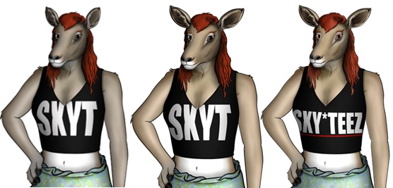
It’s also the blending mode I use to add light to reflective surfaces on characters, such as hooves, nails, teeth, or jewelry. Lesley stands on hooved feet, so her ‘toes’ and fingernails are a bit reflective. I also want to point out here that the base colors of the clothes changed – I couldn’t settle on this at first. But that’s what’s great about putting everything on different layers. You can change details like that so fast if you come back to it later and aren’t happy with it.
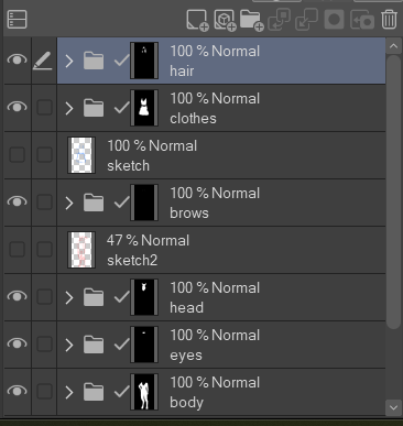
8. Separate the head for facial expressions
We have (most of) a sprite, but it’s only one pose and one neutral ‘look’. That’s not good enough for me! I like when characters express themselves. To make that happen, I have to start thinking about what facial expressions the character will need for the story, and how I will organize them in the Clip Studio project. We’re far enough into the process where I can break the character’s head off (violent?) into its own group of layers for further work. When doing this, I use the Selection tool and select an area that extends below where the top of their clothes start by their neck or shoulders so that a ‘break line’ isn’t visible. (What do I mean by break line? Well, it’s one of the few things that irks me about Clip Studio: it doesn’t cut cleanly. There’s usually a faint 1-pixel-wide space that’s left behind… haven’t figured out how to avoid this yet.)
Use “Cut and paste” to separate the head from “Folder 1” – the body. Its mask will be maintained with the new group of layers. The new group needs to sit above the rest of the body in the layer hierarchy, but below the clothing group (Folder 2).
As for why I sketched the eyes and hair, but never vectorized them: these features go outside the “head” group of layers because the eyes will move around, but the shading on them should not. Same with the eyebrows; all characters express using their brow line, so their shading actually needs to change at times. Her hair will be long, going over the head at points but also the clothes; it’ll need to be in its own group of layers at the top.
Managing layers is one thing. The science of interpreting how an anthro character’s head changes shape depending on their mood or if they’re talking/not talking... I don’t want to get into the details of that here. It’s not my call, really – you have your own art style, or at least you have fellow furry artists whose art style you prefer. My sprites are fairly realistic, so it takes a lot of studying funny animal expressions, or other furry art containing these species, to get a grasp on it. Mammals with ears? Those things flatten out or change angle depending on their mood. Teeth? Had to learn how to draw those. Rodents and equines have very strange teeth, by the way.
But I digress… It’s a process, and every artist goes through it. Just be patient; you don’t have to get their head right the first time. Lesley will have movable eyebrows, eyes, eyelids, and (maybe) head positions. For example, in Chet’s updated sprite, each facial expression has its ears move a certain way – and in the next build, his tail will wag too! But I wouldn’t have been able to do those things as easily if his tail was on the same layer as the body.
9. Set up for layered imagery in Renpy
Now I have to play 4D chess. When I’ve completed posing, clothing, shapes and everything… well, the reason I separate the head from the rest of the body is because I save the head as a separate PNG file.
Renpy supports something called layered imagery, which lets you cut and paste the pieces of a sprite together and change each individual attribute (like a character’s eyebrows) independently from the rest of the image. I don’t want to go into the details of how this works either; not everyone uses Renpy to make their visual novels, and there’s a blog/document that GruntSteel (sprite creator of Limits) put together that explains everything really well.
Every head pose, body pose, eye direction, tail position… it’s saved as a PNG file in a folder in the game directory as its own thing. GruntSteel describes it like a Mr. Potato Head – you’re sticking all the parts individually into a folder in your game so you can mix and match them later. Here’s a screenshot of what Qiang (Mike)’s folder of ‘body parts’ looks like:
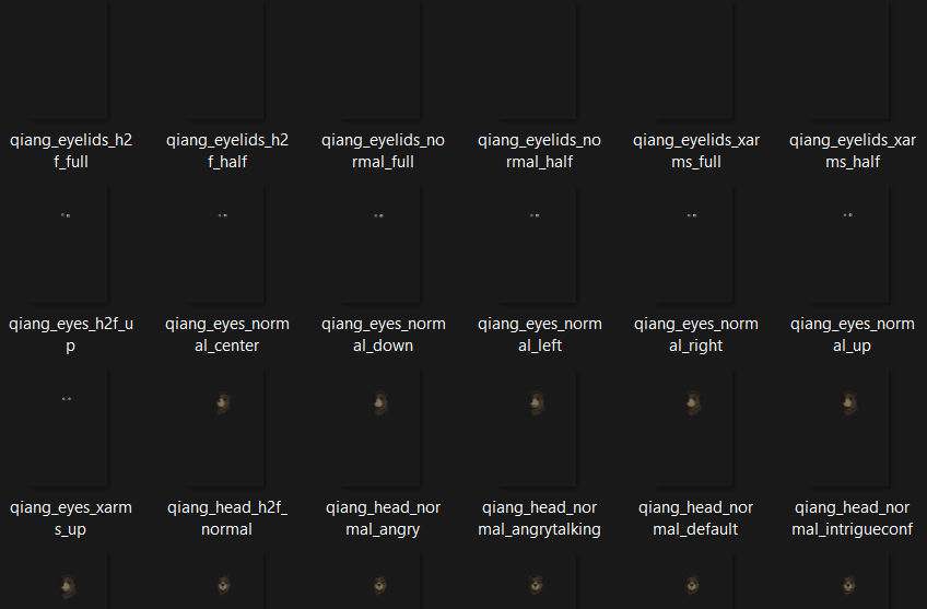
If you’re creating a minor character who only has a handful of scenes, I don’t suggest doing this process. You’re better off having 3 or 4 full-body PNG images of the character than 25 partial body images.
10. Additional clean-up and posing
It looks like we’re done! WRONG.
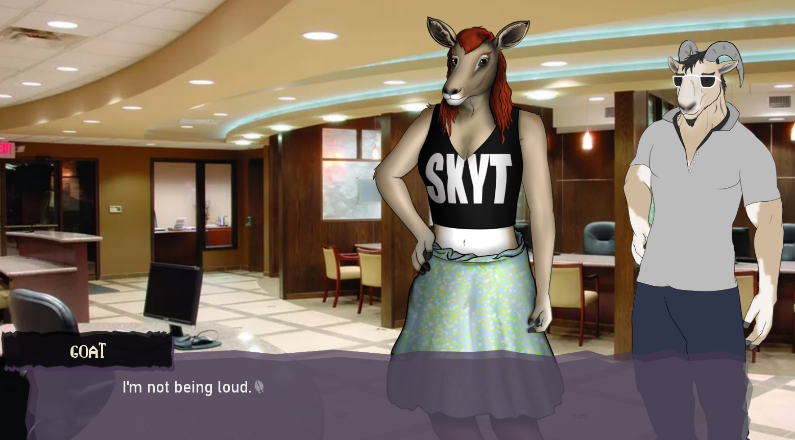
You should definitely put a “test” version of the character into a scene of your visual novel and see how they look. It changes things! She isn’t supposed to be bigger than the goat character to her right, and her eye color isn’t discernable at all, so we need to lighten it up, or make the pupils smaller. Got a bit *too* realistic with that, maybe.
Also, have you flipped the canvas yet? If your character’s going to change the direction they face, OH MY GOD you need to flip the canvas. Here are my quick notes about the shit I failed at:

You may decide after looking at them this way for a while that there’s something you should do better or need to fix up. Because I separated all the parts out, it isn’t as daunting of a task as it used to be – I can focus on fixing individual parts. However, if I need to adjust the line on a character’s chin, I will need to do this for every head sprite I drew. That can be daunting, but that’s the life of an artist.
Conclusion
Even after I thought I was adequately done, I wasn’t… I shared the left image as a WIP to my online friend, and they recommended making the ears bigger and enhancing the base colors so that her ‘impala’-ness was more obvious. In that way, a sprite is never done. You just get satisfied enough to stop making changes to it.
But at least that’s how my experience has been. In three years’ time I’ve redone so many character sprites it’s not even funny.
But I’m hoping in the next few builds or so I’ll be doing less sprite work and more CG/scripting work because of the efforts put into the above. I’m happy with the process and don’t intend to add or change too many things at this point until after I’m done with Aaron & The Void.
What do you think? Are there certain aspects of this process you’re particularly confused or interested about hearing more? What types of character art do you find most appealing? Are you adding paw-pads to your rabbit characters (HINT: They don’t have paw-pads. Stop doing this.)
Do you have any questions for my process? Let me know in the comments below – and have a great rest of your summer! We’re nearly done with scripting, so the Halftime Report will be coming next.
-E
Comments
Log in with itch.io to leave a comment.
That's really cool!
Really interesting to see one's approach to this process, especially for someone who might be interested in making their own VN. Informative stuff.
Thanks! That's kind of why I wanted to write this - this isn't the "best" or "correct" way to create, but it does show an example of what us artists do to bring characters to life :)
That's a lot of work you're making. I respect you. By the way, I like your visual novel.
Yes, and thank you for the kind words!